Showing posts with label indie comics. Show all posts

Sunday, June 2, 2013

Abstract 3

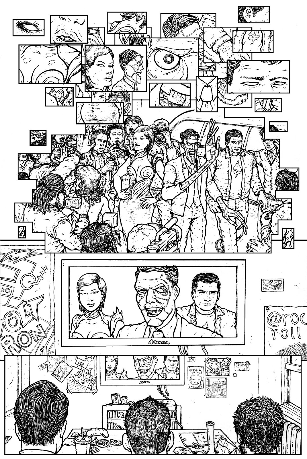
Here's a five page preview of Abstract 3, a creator owned one shot written by me and illustrated by Ramon Villalobos.
The Abstract 3 is a superhero team that specializes in dealing with abstract threats that are surreal and incomprehensible. Dr. Abstract, Lady Plasma, and The Mass are the founders and sole share holders of a multibillion dollar corporation that produces comics, cartoons, and films based on their superheroics...but a strange being from beyond space and time reveals that Dr. Abstract’s incredible success as CEO of Abstract 3 Incorporated is not what it seems.


News on how you can read Abstract 3 and more preview images will be up soon.

abstract3comic.tumblr.com

EMBRACE ABSTRACTION

Monday, December 24, 2012

Michel Fiffe Talks COPRA!


It seems like COPRA is heavily inspired by John Ostrander's classic run on Suicide Squad...do you feel like COPRA diverges from Suicide Squad in major ways, such as the way that it seems Man-Head and Marty are family men doing a job rather than imprisoned supervillains?

Sure, I'm only using the Ostrander set up and a starting point, as a way to go off in different directions within a solid framework.

Something I find highly interesting about COPRA is the way that you're writing, illustrating, and producing it, all yourself. How do you feel about being the singular creator of COPRA? 

I honestly don't know any other way to do it. Stuffing envelopes, that may be the one thing I may have to get help on.

What was the decision making process like for embarking on this ambitious project of singlehandedly producing a continuing, monthly series? 

It seemed like the next natural step, despite the intimidating nature of the schedule. Now that it's at the point of no return, I'm too busy to freak out.

Do you envision COPRA continuing beyond it's first year of 12 issues?

 Maybe, it really depends on how the first 12 are received.

Do you have any other projects in the works that you want to talk about? 

Zegas is my other comic series with a cast that's less hyperbolically brutal but still very close to my heart. I ultimately want to work on both comics back to back.

Tuesday, December 18, 2012

COPRA #1: Raging Wrath


I went into reading COPRA #1 not knowing what to expect. I knew that Michel Fiffe had created a Suicide Squad fan comic called Death Zone, and I was aware from the preview pages that COPRA was an original creation that was in the same vein as Suicide Squad. Beyond that, I really didn't know what I was getting into when I read my copy of COPRA #1, a monthly comic written, illustrated, produced, and distributed by Michel Fiffe. What I found is one of the most enjoyable first issues that I've read in a long time. COPRA is a sci-fi psychedelic mind bender of a superhero action comic...it's got intense, expertly orchestrated fight scenes and reality warping craziness, but it's also got characters that are interesting and I legitimately cared about them when Fiffe made it clear that everyone in COPRA is expendable.  


COPRA #1 opens on the titular team being deployed on just another of what we assume are countless missions that they've dealt with before. From the first panel, I was struck by Fiffe's ability to use sequential storytelling to convey ideas efficiently. We see in the first panel a silent establishing shot that makes heavy use of negative space, and your eye is drawn to the right of the image where we see a smoking and destroyed building that pulls you into the story immediately with the question of what happened there. We learn in the following panels that the leader, "Man-Head", is the cousin of someone who lives in this unnamed, presumably foreign city, and that he has been sent here with a team to deal with whatever strange phenomena blew up that building.


Fiffe then introduces us to COPRA, and the premise of the series. The idea of the comic is similar to Suicide Squad, and the so far unseen narrator describes COPRA as a collection of, "the dangerous and the hostile" who go on "black ops outings". Right off the bat, the narrator makes it clear that the team as we see it now is not a permanent fixture, and "some died, some stuck around"...none of these characters are guaranteed to survive this mission, and this makes the stakes of the narrative a bit higher. Fiffe does a great job here of succinctly describing COPRA with great tag lines like, "The throwaways had dirty work to do," and "They've humbly described themselves as the wrath of god by way of loser assassins." 


Fiffe then gets into introducing us to each member of the team through an engaging conversation between the characters. One of the strongest points of this comic is that the members of COPRA are not only appealingly weird (they look like they could be straight out of the Doom Patrol reserves), but they talk like real people. They're also pretty much all original characters except for Lite who is an obvious parody of Dr. Light. In one page, Fiffe concisely acquaints the reader with almost the entire team in just four panels through the narrator's descriptions and their pre-battle bickering with each other. 


Lite is the only character who doesn't feel comfortable with some small talk before the mission...the captions describe him as a "neurotic crybaby despite a power suit", and he's the only character who is paranoid about the weird skull with a strange, lightning bolt shaped object sticking out of it. This skull, also on the striking cover of the comic, is just sitting in the back of the van with the team, and Lite points out that they could all be getting radiation poisoning from the crazy thing. We see in the above page that Fiffe has a tight shot on the skull that parallels the following tight shot on Man-Head, which foreshadows the thing's importance and instills a sense of dread in the reader. We also learn in this page that this is an "unauthorized mission", a piece of information that Fiffe drops at exactly the right moment, right before everything goes to hell.


COPRA is confronted by another elite, superpowered team who want the skull-bolt, and "Marty", who was just talking to Man-Head seconds earlier about how his kids have stopped laughing at his jokes, is impaled. Fiffe then gets into 7 solid pages of some of the most amazing superhuman action I've seen in comics in a while. Fiffe's style is extremely kinetic and he conveys a sense of movement that just leaps at you through the page. This sequence is also hyper violent and in the first few panels the neurotic Lite is killed with a machete, following through on the Fiffe's implied promise in the beginning of the book that none of the members of COPRA are safe from death. Almost no words at all are used in this sequence as utter chaos erupts and superhuman soldiers spring into action. 


Fiffe has a dynamic style, and his splatters of paint and scratchy black inks are perfect for this kind of relentless action. His panel lay outs also greatly serve to enhance this action scene, and he ends the sequence of mostly wide panels with a two pages of a 12 panel grid. This is where this brutal action scene moved into the next level for me...we see that two members of COPRA, "a couple: sniper & brawler", are confronted by the leader of the enemy team "Vitas", who used to be with COPRA.


It's not really necessary to totally spoil what happens here, but use your imagination...there's a genuinely heart breaking set of panels where the hyper violence of the scene is halted for a brief moment to focus on this couple and what happens to them. Here, Fiffe takes this 7 page sequence of kinetic, fast paced, gruesome action and turns something that could be gratuitous into something that connects with the reader on an emotional level. These aren't just action figures banging against each other...Fiffe gives you the sense that the stakes are real for these characters, and his hyper violence comes with hyper tragedy as well.

COPRA #1 is a stellar first issue that establishes the premise of the series, the main obstacle for these characters, and the new situation that the team has to handle. The art is a really beautiful mixture of a feeling of homemade, DIY aesthetic that seems like Fiffe did it all with colored pencils, and a refined, professional look. The presentation of the comic itself, such as the highly stylized cover and inside cover, the nice paper quality, the letter from the creator on the inside back cover, is extremely professional in the way that it's been produced. Fiffe has also created trailers for the first and second issue of the series that are very cool.

Of course, this is all icing on the cake of Fiffe's compelling, action packed story with weird and interesting characters, but it was a major selling point for me when I subscribed to the next 11 issues of this series. What I find so amazing about COPRA is that it's a comic completely written, illustrated, and produced by one person and there is a concrete goal of putting an issue of the series out once a month. That's an ambitious and difficult project for one person to manage, and I enjoyed the first issue so much that I'm on board to support it. You should be too...check out COPRA #1, and the second issue is out now.


Tuesday, November 13, 2012

Saint's Way: A Superhero Mystery Thriller

"Saint’s Way, a webcomic in the style of a graphic novel, is about family, superheroes, magic and SCIENCE! Set on an Earth not quite unlike our own save for a few special individuals, the adventure begins with the escape of Vivian, a very angry, very strong little girl who sets her sights on New York – a recently evacuated city due to the threat of alien invasion."
I don't remember exactly how I stumbled upon Yasmin Liang's webcomic Saint's Way, but I was hooked from the first few pages. Saint's Way is an engrossing superhero mystery thriller that involves the escape of a young superpowered girl named Vivian Saint from the Saint Organization, a military standoff between Earth and aliens, and the superheroes of United Heroes who react to this odd superhuman girl and the mystery of her parentage.

I read every page of the weekly webcomic, from April 2011 to July 2012, in one sitting, and it was fascinating to witness Liang's already great art evolve over the course of 55 pages and more than a year's time. You can really see her sequential storytelling skills building exponentially as she gets further into writing and illustrating Saint's Way. Her panel layouts become more experimental, playing with the shapes and arrangement of panels, and she uses interesting color and design choices to amplify the impact of the narrative. Her writing in Saint's Way is also very effective at ensnaring you into the mysteries of the story...Saint's Way is structured in a way that pulls you into a strange story puzzle of clandestine organizations and superheroes, it's a superhero mystery thriller that leaves you on the edge of your seat for the next week's page.


Saint's Way begins with the surprising image of Vivian Saint, a young superpowered girl, tearing a driver out of his truck. Vivian is in the middle of an empty desert with rising smoke on the horizon, suggesting some sort of violent escape, and the truck stops to help this apparently lost girl. Of course, not everything is as it seems on multiple levels, and Vivian just rips this guy out of the truck and drives off in the vehicle. Liang's full page illustration here conveys the violence and speed of this moment very well; the way that the driver's hat pops off, the crumpling of the metal car door, the look on the driver's face and the painful angle of his arm, and especially the subtle blurring of the door all suggest motion in such a convincing and dynamic way.  


The story then cuts from this scene to Solomon Wynn, a bounty hunter who is making himself a sandwich while watching a news broadcast that gives us some exposition on the alien invasion of New York City. Wynn's enjoyment of his sandwich is rudely interrupted by someone at his door, "Phyllis", a slightly purple skinned representative of the Saint Organization. Phyllis wants Wynn to find and retrieve Vivian, and we learn in this scene that Wynn is an empath capable of sensing other people's emotional states. Liang also develops the mystery the extra step necessary to reel you into the story even more...Phyllis went to Wynn because of his penchant for bringing back his targets alive "even when it doesn't matter", and this time, the implication seems to be that it definitely does matter.


Meanwhile, Vivian has made her way to the mostly evacuated New York City. Not much happens in the way of story in this page, but I felt compelled to say something about it for a few reasons.  The first panel is a beautiful establishing shot of NYC. Liang uses a fish eye lens effect here that warps and distorts the wide panel, and it really gives you a sense that you're on the street with Vivian. More than that, there's an amazing amount of detail in this panel. Beyond the first panel, Liang really lets the story breath here in the rest of the page. She conveys the feeling of an empty, evacuated NYC, and her use of negative space in the fourth panel and the close up on the pigeon feather in the fifth is just beautiful, simple sequential storytelling.  


Vivian is surprised by a superhero dramatically crashing into the pavement in front of her, and we meet Citizen III. One of the most stunning elements of Saint's Way is Liang's design sense. Citizen's III's superhero outfit is beautifully designed. It's simple and somewhat minimalist, and the incorporation of a golden Civic Crown gives the outfit a bit of an ancient and classical look. The three golden stripes also represent the "III" in Citizen III, and of course, her father Citizen I and brother Citizen II each have the corresponding amount of stripes on their respective costumes.

Besides just having a really cool look, Citizen III is a relatable character with an interesting back story. Her dad is Citizen I, and he comes across as an overbearing, helicopter parent superhero, and her brother is Citizen II who is the beloved, overachiever child. Citizen III is grounded by her father for impulsively attacking the alien invaders, who are seemingly just parked above NYC, and she's desperately trying to live up to the expectations of her superhero father. It's a family dynamic that resonates on an emotional level, and makes these characters interesting.    


The debut of Citizen III on that page marks the beginning of Liang's experimentation with panel shape and lay out. You can see in the above page that as the series progresses, Liang begins to arrange her panels in new and strange ways that play with the medium. 

I should mention here that Saint's Way is 55 pages long, and I think it would do a disservice to the comic to painstakingly detail the plot in this review. My plot summary can only dilute the mystery and intrigue of the story, so you should probably just read it yourself. Instead, I'm going to focus on a few key pages that illustrate the awesomeness of Saint's Way.


Here, we see Citizen III in action, and again, Liang uses a subtle blurring effect on her first to communicate a sense of motion. I really like this effect and the way that Liang uses it to emphasize the speed and force of the attack. It gives the image an almost animated look, as if this is a still image from a cartoon rather than a panel in a comic book.


This page is really striking. Liang transitions from Citizen III flying through the city to Vivian talking in an apartment in an amazing way, using negative space and color to bleed from one panel to the other. Again, Liang's design sense is what makes this page so good...the neon blue, negative space bridge and city horizon combined with the purple night sky, and the way that it seamlessly stretches into the below panel is a really cool experimentation with the medium of sequential storytelling.  


You can see here how Liang's design sense enhances the narrative in a really interesting way. Citizen III is shot in the back, and Liang illustrates this with variations in shape and color in a way that can only be achieved in comics. The red, lightning bolt of pain that illuminates Citizen III's back in normal colors, and the faded yellow and black outline of the rest of the image is a stellar use of color palette and shape to convey the shock of this moment.

The appeal of Saint's Way lies in Yasmin Liang's abilities, both as a writer and an artist, to draw you into the puzzle of the story. Her pacing over 55 pages manages to keep you interested in the unraveling of the mystery by slowly revealing answers that only create even more intriguing questions. Over the course of more than a year, you can watch as her experiments with panel lay outs, colors, shapes, and design evolve into something pretty remarkable. Saint's Way is a compelling superhero mystery thriller, and you should check it out.

Thursday, November 8, 2012

Curt Pires on LP and Rock and Roll Comics

Curt Pires answered my questions about his one shot comic LP, his thoughts on his creative process, and the melding of comics and rock music.

How did you come up with the concept for LP?

To be honest, I can't really remember when I specifically came up with the idea for LP, but I had been fooling around with some different music/comic ideas because I was really into it.  I  had written a couple of different scripts, kind of a bit in a similar vein about the idea of what would happen if people tried to steal records, sort of playing very literally with the idea of the value of music.  That didn't end up going anywhere, and then I was in this phase of listening to a lot of this band called Thee Hypnotics, it's this band Paul Pope's super into, and I was reading a lot of Paul Pope's stuff and just listening to this music, and not really reading a lot of other comics.  I don't really pull from comics in particular because I'm not a shut in or anything...I get out, and I'm super into music and stuff, so I sort of had all these different ideas and I decided to sit down and try and write a one shot about this story.  My initial concept was to explore the idea of a heist , but they're trying to steal a record. What if a record was the most valuable thing in the world?

LP has a couple of places in the book where there are direct quotes from classic songs, such as "withinuwithoutu", "shiver and say the words of ever lie you've ever heard", "be here now".  How do you feel about music as an inspiration for your comic book writing, and how do you try to meld those two different mediums?

I don't really know how to answer that question...I don't really know how one does it properly.  I think we sort of did it on LP, I think they did it on Phonogram, but I don't know if there's really a particular science behind it.  It's still a weird sort of thing, because it could just as easily fall flat on its face and make no sense, but I think in both pieces it sort of works.  I won't assess LP in relationship to Phonogram...I think in Phonogram they did it amazing.  I just think if you really like music and you really like comic books they just sort of bleed together.  There's a very thin membrane in my head between the two mediums.  I think they're pretty intertwined.

Do you feel like Phonogram is kind of a big influence on LP?

Not like a huge influence.  Like I said, the Paul Pope stuff was a bigger influence on it than Phonogram.  There's this Paul Pope story printed in the THB book one shots that Ad House put out, which is like this six year old kid listening to a David Bowie record.  That was the biggest music comic influence, that five page story, but just sort of the energy of Paul Pope stuff.  It's not getting bogged down in a comic book is a comic book, music is music, I'll take the energy of rock and roll and fuse it to a comic book which is why the whole comic book is basically just this F guy being a huge douchebag and just doing drugs and getting into these crazy situations.  I just want to make rock and roll comic books.

On the LP website, you describe LP as "in the style of Our Love Is Real".  I'm wondering how you feel about producing one shot comics as a way of breaking into the comic book industry in a similar way that Sam Humphries did?  How do you feel about one shot comics in general as a specific way of telling a story versus long form, six or seven issue story arcs?

When you're wanting to break in, it's probably the smartest thing to do.  So many guys who try to do these six or seven issue miniseries to break in, it's honestly really stupid.  They don't have the means to distribute it, they don't have the means to really publish it, and they go broke making them.  A lot of the time they're not even really good, so the Our Love Is Real thing, the comparison on the site, is a very calculated thing because basically if you make an off beat one shot book, that you can manage to infuse your creative ethos into it, and you manage to make it unique, professional quality...you market it in a professional way to people, it's a valuable avenue for sort of introducing yourself as a creator, so I think it's the smart thing to do, which is why I took the gamble doing it, right?  And comparatively, it's a lot less of a risk than...like doing six or seven issues is such a pipe dream.  When I see someone online talking about doing that, an extended superhero thing for their indie debut or whatever, it seems real stupid to me, taking into account the business side of distributing and publishing your own work before you pull the trigger on any one format.

In LP, you put text in the gutters a couple of times.  For example, that thing I mentioned earlier, "withinuwithoutu".  Unless I'm mistaken, I think you do it at least one or two more times, so I'm wondering how you feel about that...that's something I saw in Matt Fraction's run on The Defenders.

That's where I pulled it out of, The Defenders.

Oh, interesting!

That book was one of my favorite comics being published for like the longest time, and they did all that cool stuff.  They'd have the narrative running in the book, and then you'd have the gutter captions which are almost like their own narrative.  I thought it was cool, the idea of a counter narrative.  So me doing that in LP was a direct result of how I saw it worked in The Defenders.

Are there any other projects you have in the works that you want to talk about?

I'm doing a book with Dalton Rose that I can't really talk about too much.  I don't want to do that thing where creators talk about their stuff so much in interviews so by the time it comes out, you already know everything about the book.  We've been talking to a publisher a lot today.

Monday, November 5, 2012

Ryan Ferrier Talks Tiger Lawyer and Challenger Comics

Ryan Ferrier was kind enough to answer my questions about his comic Tiger Lawyer and his new self publishing imprint Challenger Comics.  After you read the interview, I'd recommend you check out Tiger Lawyer or some of the free comics available over at Challenger Comics.

What was the genesis of the Tiger Lawyer concept?

I'm not exactly sure what planted the seed for Tiger Lawyer, but it started as a tweet last December. I tweeted something silly, as I do, about my next comic being 'Tiger Lawyer' with no intentions on actually doing it. After some boisterous encouragement from several friends, I actually put pen to paper and wrote the first segment from issue #1, Attorney at Rawr, over one weekend. I then put the script online, and long story short, artist Matt McCray and I crossed paths and decided to give it the ol' try. From there it turned into actually putting this book together, and getting artist Vic Malhotra involved was a wonderful thing.

Something I find interesting about Tiger Lawyer is that the first issue has stories of wildly different styles...one is cartoony and fun, and the other is distinctly noir.  Both types of stories worked for Tiger Lawyer...how do you feel about this elasticity that the character has?

Honestly, I feel like that's the only thing that can keep the comic going. There's only so much you can do with the character himself, as endearing as he may be. I think for me as a creator, it's less the character that appeals to me, and more the different sandboxes he lets me play in, or want to play in. The plan is to go in some seriously crazy directions; at some point I even plan on doing a Tiger Lawyer manga.

Do you have long term plans for Tiger Lawyer's story arc?  Have  you plotted out far into the character's future, or do you prefer to write the series  more organically and let the narrative develop without elaborately constructed plot?

With the more comedic stories, Matt's stories, they're all self-contained shorts, so I can start from scratch every issue. With Vic's stories, the noir ones, there has been a story arc. Vic's stories in issues #1, 2, and 3 are three parts to a whole. With future issues, I can see that continuing; I like the thought of having both self-contained stories, and bigger narratives to work with. I should mention that Vic's story in Tiger #3, which is the conclusion to the current noir arc, is one of the most fun things I've ever written, and probably Vic's best work, which is frightening, as he's always been awesome. Matt too, he's an incredible visual storyteller.

You launched your Challenger Comics self publishing imprint, coincidentally, the same day that I published my review of Tiger Lawyer #1.  The imprint seems like an exciting move...what inspired you to create it?

Thanks! It is exciting. I also don't want to play it up as if it's this big publishing endeavour. I'm a fairly hungry young creator, and I've been working on pitches for the last couple of years. They're all kind of going out there now and I feel like taking a tiny step back and focusing on short-form work, one-shots, comics I can actually produce and show, and not just send to editors and have it live or die there. I want to write and create and get better, and I want to have work to show for the time I'm putting into it. So basically I've set up Challenger as a self-publishing imprint, one centralized place for me to put out that kind of work, be it online for free, or selling books through the store. And I've been fortunate enough to get to know lots of inspiring, talented creators who are doing the same, and have extended that to them. So Challenger is a home for that, for people to create and display in one single spot. Hopefully we can all build off each other and benefit each other and just have a positive resource for creators that want to produce passion projects.


Challenger Comics has a few free, short comics available.  How do you feel about releasing free comics as a way to get people excited about buying your comics? 

And there's many more on their way! I think it's pretty important not only as a creator, to help you get better, but for exposure. At this point in my comic life, I just want to produce work and get better, and have people read it, be it other creators, editors, or fans. I want as many people to see my work as possible. I've got mini-series and pitches that I'm working on, and I'm going to need to make money and turn this into an actual career, but that's a ways away, and right now I'm focused on becoming a better writer, and I believe this is one way to do it. And I'm just having a lot of fun, and enjoying getting the chance to collaborate and work with other great creators.

Do you have any upcoming projects you'd like to talk about?

I'm mostly focused on a few shorts for Challenger that will be coming out over the next few months, and Tiger Lawyer #3 is going to be awesome, and out around Christmas. My mini-series The Brothers James (215Ink) is gearing up to return in a big way, with Brian Level on art, and Michael Walsh handling covers and some interiors. Issue #2 will be out early next year, with a total of #5 in the series. I've got a couple other projects in the works, that I can't really talk about right now. And as always, I've got the odd pitch I'm working on.

Thursday, November 1, 2012

Tiger Lawyer: Law of the Jungle


I first noticed Tiger Lawyer when it was featured in Hell Yeah as a back-up comic, and I was immediately struck by the strangeness of the concept.  Ryan Ferrier, writer and creator of Tiger Lawyer, has taken two completely disparate ideas and mashed them together in a way that shouldn't work.  You shouldn't be able to tell interesting stories about a practicing lawyer who is, without any explanation provided at all, also a humanoid bengal tiger.  However, I read Tiger Lawyer #1 and I think that Ferrier has done just that.  Tiger Lawyer is a comic that has something for everyone.  It can elbow the reader in the rib cage and defy you not to laugh along with it at itself, or it can be a surreal noir that takes itself seriously with only the occasional wink.

Tiger Lawyer #1 begins with an eight page story, "Attorney at Rawr" with writing by Ferrier and art by Matt McCray.  The story begins with the closing arguments at a murder trial, and Tiger Lawyer is the defense.  Attorney at Rawr is unabashedly fun and lighthearted in both its tone and artistic style.  Ferrier doesn't pretend that this is a realistic depiction of an actual murder trial, and he writes Tiger Lawyer as an impossibly smooth talking attorney ridiculing his client and the hilariously named prosecutor "Jilm Swamsert".  McCray's art matches Ferrier's writing with a cartoonish style, and his Tiger Lawyer looks just as suave and confident as Ferrier writes him.


After declaring that his client is a "fucking idiot", "a scumbag", and a "horrible human being", Tiger Lawyer shreds the prosecution's argument by revealing that the defendant's diabetic foot would prevent him from leaping a fence in the way that the murderer did.  Tiger Lawyer then proceeds to accuse the prosecutor of being the murderer, and the jury just loses their minds with happiness as if they're at a boxing match instead of a murder trial, and the losing fighter is making a miraculous come back.  Of course, with absolutely no evidence produced against him, the prosecutor doesn't deny his guilt, but rather he leaps onto a table and shouts, "Ya damned tiger bastard!  I'll kill ya!", at which point Tiger Lawyer fights him in the middle of the court room.

The story is topped off with a page of Tiger Lawyer in a hot tub with two beautiful women celebrating his legal victory.  There's the obligatory Tony the Tiger joke, and then an awesome page that reads like the intro sequence to a nonexistent Tiger Lawyer TV show, complete with amazing theme song lyrics such as, "He cleans the streets/and he eats raw meats/with the finest snakeskin/on his cat feets".  Attorney at Rawr dares you not to chuckle at a comic that isn't afraid to laugh at itself and bask in the silliness of its premise.


The second story in Tiger Lawyer #1 is "Dead Cat Walking" with writing by Ferrier and art by Vic Malhotra.  You can tell that Dead Cat Walking is going to be the polar opposite of Attorney at Rawr from the image of Tiger Lawyer shrouded in inky shadows on the title page.  The story details the first case that Tiger Lawyer ever lost, and like Attorney at Rawr, it's also a murder trial, but it ends with a man sentenced to death rather than a slapstick fight between attorneys.  Malhotra's art in this story is beautiful.  His heavy blacks and smokey darkness gives the narrative a distinctly noir atmosphere like you would find in an old black and white, private detective movie.


Tiger Lawyer reassures his imprisoned client that he's going to "fix this", and that the case was rigged in some way.  From there, all the classic elements of the noir detective story come into play.  You have the attempted assassination of Tiger Lawyer because he's digging too deep, you've got the corrupt District Attorney, you've got political intrigue and conspiracy, you've got an innocent man condemned for a crime he didn't commit, and of course, Malhotra provides the moody and monochrome atmosphere.  The only thing out of place is our hardboiled protagonist who is inexplicably a talking tiger.  This element, and the occasional reference to his animal nature ("Boss said this guy was a real animal."), lends this surprisingly serious and straight faced noir story a surreal dimension.


The thing about Tiger Lawyer that interests me is that he's a character that is extremely elastic.  He can be a goofy, fun joke of a character.  Tiger Lawyer can embrace his own ridiculousness.  The idea of a jungle cat acting as legal counsel is absurd, and it's fun to read a story that capitalizes on that absurdity.  On the other hand, Tiger Lawyer can also be a surreal noir.  Tiger Lawyer can be a dark narrative in the vein of private detective stories about a lawyer dealing with crime and corruption, but with the surrealist wink of a humanoid tiger (tigernoid?) protagonist.


There is an adaptability to Tiger Lawyer that is fascinating to me.  The 11 pin ups at the end of this issue illustrate that fact in the diverse variation of their styles and the way that they depict Tiger Lawyer.  This adaptability reminds me of a series that is similarly created with ideas that are totally unrelated to each other: Teenage Mutant Ninja Turtles.  TMNT can have a dark tone when it parodies Frank Miller's Daredevil, but it can also be light and fun.  Tiger Lawyer feels like it has a similar ability to stretch itself to fit comfortably with tones ranging from dark noir to bright, cartoonish fun.


Beyond the flexibility of the two ideas, there's something to be said about the fusion of concepts you would never associate with each other; like ninjas and turtles, you would never associate tigers and lawyers with each other, and bringing them together produces a jarring but also weirdly enjoyable feeling.  It's like the conceptual synthesis of jungle predator with refined legal practitioner produces cognitive dissonance.  This feeling of cognitive dissonance immediately surprises you and engages your psyche on a subconscious level.  Of course, this is just my own pseudo science theory, but I think that cognitive dissonance plays a part in making Tiger Lawyer a catchy concept.

At first glance, it might seem like Tiger Lawyer shouldn't work, but it's an idea that is surprisingly pliable.  Tiger Lawyer can be as silly as you want him to be, or he can be a noir action hero and be as darkly surreal as you want him to be.  You can get the first two issues of Tiger Lawyer here, and it seems like Ferrier is getting ready to have issue three available soon as well.  Tiger Lawyer is a strange beast of a comic, and I'd definitely recommend that you check it out.

Thursday, October 25, 2012

LP: A Sequential Single

F has it all . Fame, Fortune , Women, and enough chemicals to make his head spin, but when he picks up a strange record his life changes forever.
Pulled into a world of mysticism, shamanic electric guitar feedback and mega yakuza , F gets way more than he bargained for.
One record can change the world.
(Full disclosure: I'm currently collaborating with Ramon on a comic project.)

LP is a one shot comic written by Curt Pires and illustrated by Ramon Villalobos.  The plot involves a rock star who possesses an LP record with mystical properties, only to have it stolen by "mega yakuza" on one hand, and sought after by gangsters in bunny masks on the other.  However, that's not what the comic is about.  LP is about music. It's about that strange alchemical power that music has over ourselves and the world as a whole.  LP is an explosion of psychedelia, it's a weird, genre defying mixture of magic, gangsters, and rock music, and it will remind you that a record can possess your soul and change the world.


Pires begins LP in media res at the climactic point of carnage.  The reader knows from the captions that at some point, something we can assume is the titular LP was taken from the protagonist, and that, "There was only one way this was ever going to end".  This line can be read as a bit of metatextual commentary, given that the comic has begun with a snippet of the ending; there is literally only one way for this story to end because we are actually looking at that ending on the first page.  LP begins by dropping the reader into the middle of a massacre, and we are immediately hit with a shot of gory destruction and ultra-violence that leaves us wondering what exactly has happened here.  


The next page transitions from the previous scene of bloody havoc to a tight shot of the rock star protagonist "F" backstage before a show.  The first three wide panels of this page are wordless, and Pires lets the images breath a little after the dense first page of bloodshed.  They pull out slowly from F, and this gradual zoom out shows us his ennui and general numbness to his surroundings.  The transition from a red tinted vision of death to a very tight shot on F's green tinted mouth is jarring.  The juxtaposition would give the reader the sense that the preceding scene was a fantasy, if only the captions hadn't explicitly stated that it is in fact the end.  One of the major strength's of LP is Villalobos' coloring;  the neon glow of the colors is bold and distinctive, and more importantly, they serve to enhance the narrative flow of the comic.  


F is called to the stage, and the narrative momentum begins to build.  We learn from his internal monologue that F doesn't just look dissatisfied, he has begun to hate his fans and "The managers, the agents, the reporters. This entire generation of MTV fed future psychiatric patients".  F laments a generation of "self-described artists" only to realize that he is contributing to this culture and is just as culpable as anyone else.  Villalobos' last panel here depicts F on stage with his band in front of a crowd of adoring fans, and he uses a very interesting panel shape.  This hexagonal panel uses the negative space of the gutters to focus your eye from the crowded foreground to the stage where all the attention of the audience is concentrated.  It's like the shape of the panel is funneling your vision towards the stage, and you feel like you are actually in the audience.

I'm sure you've figured this out already based on the images you've seen, but I should mention that Villalobos is really good at drawing these crowd scenes.  The faces in the crowds are distinctive and not repetitive, the hair and clothing varies, and you get that appropriate feeling of density and chaos that a huge group of people provides.  While I'm sure they were a chore to draw, the crowds feel alive.  We learn here that F is a drug addict who is finding it hard to really enjoy "anything but his chemicals", and we see a little kid stealing a record out of a guitar case.  

Everything goes to hell from here.  


F stop by his local record store slash drug dealer to pick up a fix, and he's beat up by a gang of thugs because of his surmounting debt to them.  The mob wants his mystical record that may or may not be inhabited by an entity with Brian Wilson's face in return for his drug debts.  Of course, the LP was stolen by the mega yakuza, and F must get it back from them.  However, as I said earlier, the plot isn't important.  It's the execution of LP that makes it such an interesting and idiosyncratic comic.  

Pires peppers the narrative with lines from classic songs ("shiver and say the words of every lie you've ever heard") in a way that reflects on the themes and plot of the comic, sometimes in the gutters, and sometimes in the panels themselves as text floating outside of caption boxes.  It's like the playlist for the comic is enmeshed into and in between the panels.  It's a technique that accentuates the sequential current of the comic which Pires structures like a fast paced, rhythmic rock song that cruises along to a crashing crescendo of psychedelic insanity.


Villalobos' art in LP is, in a word, transcendent.  A cursory glance reveals a striking similarity to Quitely's work, which Villalobos admits to attempting to emulate, but there's something more there.  There's a frantic reality to his depictions of groups of people as if they are living, breathing creatures rather than pieces to move around on a page.  

The above page shows a scene in which F locates his stolen LP by meditating, and Villalobos' construction of the page is inspired.  The image of F's head divided, like an anatomy book cross section, revealing his brain and the skeletal structure of his hand is amazing.  The red balls of psychic energy orbiting his head and flowing through him, the apparition of the LP on his forehead like an opening third eye, the dotted line shooting from his mind and into the billowing panel below, it's all an extraordinary illustration and panel lay out.  There are several pages in LP that reach this level of awesomeness, and I could have spent a few more paragraphs dissecting them, but it would be better if you just read the comic yourself and I spare you a few hundred words of my pretension.

LP is a comic that, "grabs you and it doesn't let you go" in the way that a good song can.  It's about that odd alchemical energy of music.  The magic of the titular LP is a metaphor for the magic of music itself, and the way that it can "shake you to your core", possess you, and transform your consciousness.  It's a comic that is not easily categorized according to genres and expectations...it is aggressively its own thing, a sequential single release.  Pires and Villalobos have created a comic that is unique and interesting, and you should check it out.